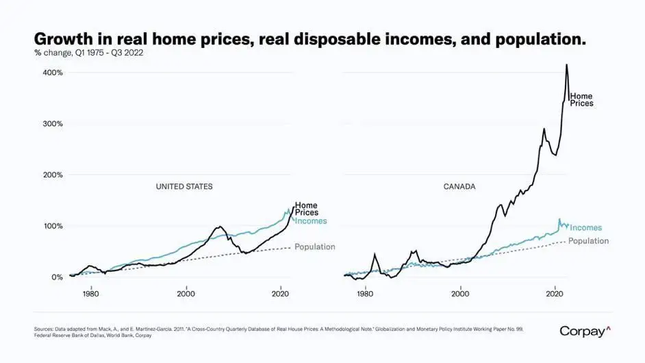
Cows Look Like Maps@sh.itjust.works to Data Is Beautiful@lemmy.ml · 2 years agoComparison of population, wage, and home price growthsh.itjust.worksimagemessage-square4fedilinkarrow-up11arrow-down10
arrow-up11arrow-down1imageComparison of population, wage, and home price growthsh.itjust.worksCows Look Like Maps@sh.itjust.works to Data Is Beautiful@lemmy.ml · 2 years agomessage-square4fedilink

That graph is insane
cries in Canadian