

cross-posted from: https://slrpnk.net/post/9709038
https://cohost.org/roguecache just made a new solarpunk logo; i think it’s very well designed and keeps the simplicity while still keeping sun, nature and technology meanings
You must log in or register to comment.
deleted by creator
I love it! I’ll probably trasform this into a sticker and slap it on the back-case of my phone, cheers!
Is it just me or dose this one looks a bit like the depressed Form of v1 (I love v1 its part of my punk-jacket). The down hanging leafs combined with the darker colors give me a more sad vibe like if the plant needs watering or something.
I get more jungle vibes from it :o
No idea what v1 looked like, I kind of think it should be flipped horizontally and maybe tilted, since it’s already making an ‘S’ with those two sets of shapes.
It was bugging me how that could be an S but wasn’t so I fixed it.

I would love something that you could spraypaint on a wall within seconds, like the anarchy-A
Honestly stencils are best for that.
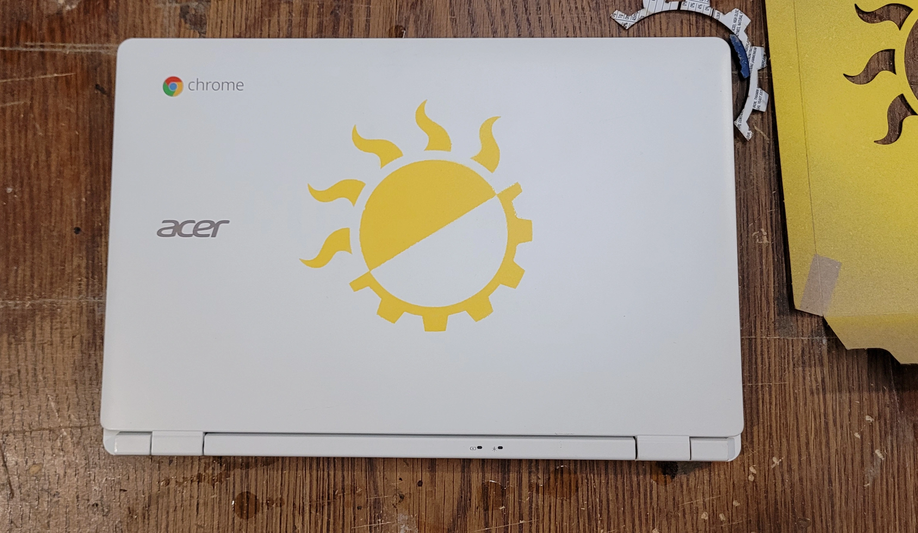
This would lend itself to stencils pretty well though (one color, no islands), especially with a touch of spray adhesive on the back. I’ve done the symbol from one of the more common solarpunk flags, and getting the blank spot inside the gear positioned would be a little finicky if doing graffiti.
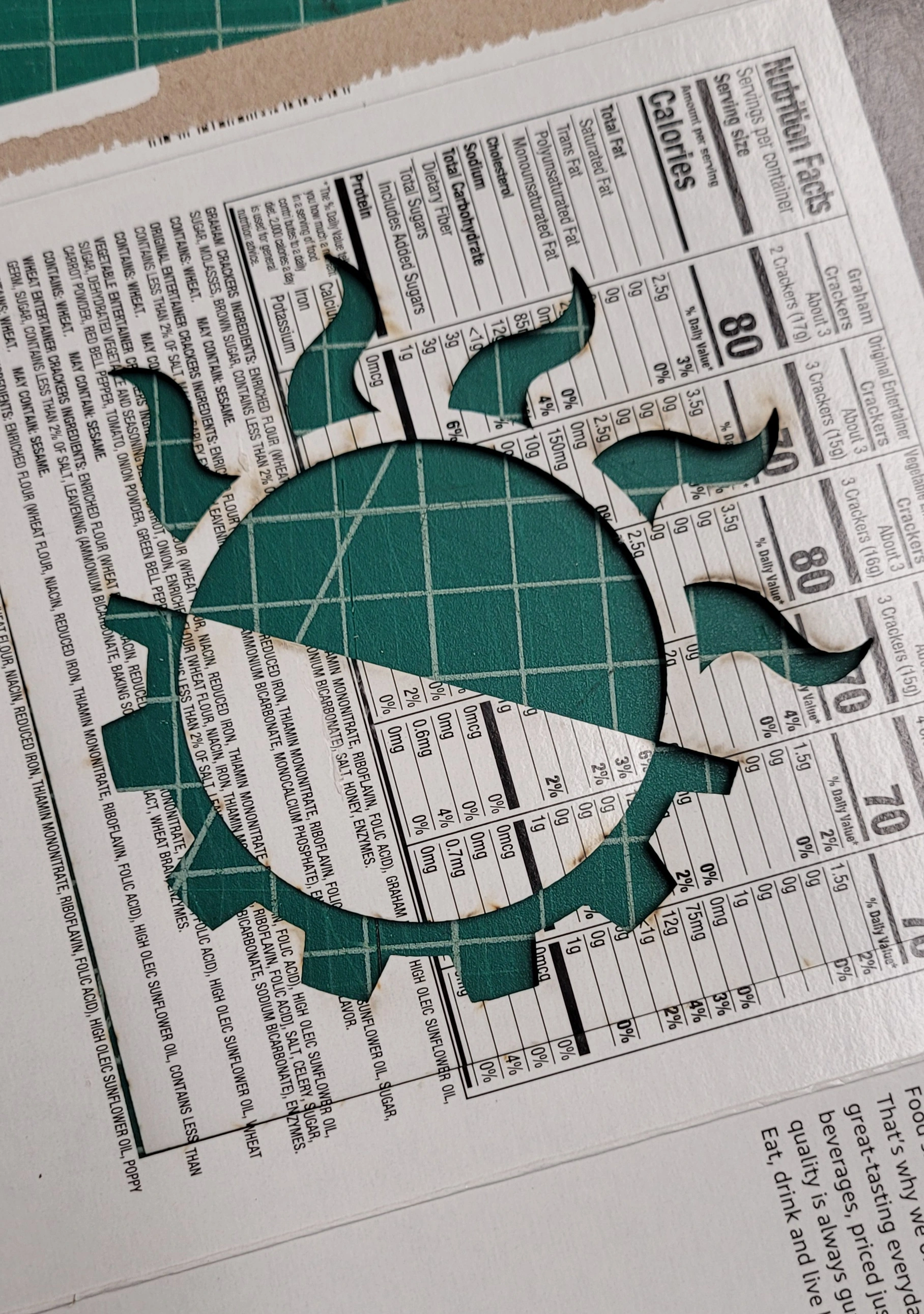
You’d want to bridge the corners there, to make it all one piece, if you wanted to be able to put it up quickly. I was just painting a laptop so I had plenty of time to fuss with it.
Once upon a project (now abandoned), a graphic designer gifted me this logo, is a carrot with electronics soldering like PCBs… https://gitlab.com/uploads/-/system/group/avatar/4402577/huertechno3-01.png I absolutely love it!