What fonts are you currently using on your system? Which do you think is best for the terminal or for your desktop environment?
(updates) Ok I think I’m a fan of Ubuntu nerd fonts right now
Noto Sans for sans-serif text (and the OS)
It’s legible, standard-looking and support about every writing system in the world. You can install it on Debian using# apt install fonts-noto, some others like-cjkand-extrahelp with the “supports about every writing system in the world”-aspect.Merriweather for the serif font fallback for the browser, as well as TTRPG campaign printouts
It’s very legible, and looks quite sexy for a serif font. There’s no package for it currently (although AUR and Nix users might have better luck), it has to be downloaded from Google FontsJetBrains Mono for the terminal TUI’s
It looks a bit playful, like lego-letters, is legible and supports about every writing system in the world.# apt install fonts-jetbrains-mono.Although I use…
Verdana for source code
It differentiates every character well and leaves enough space to easily recognise special characters such as brackets. And I don’t believe monospace fonts are more legible. It’s included inttf-mscorefonts-installerbut the font is not open-source.Lato, League Spartan, League Gothic are my three most used fonts by a wide margin. Lato and its variety of weights for most things, League when I am doing design work and need a cleaner title or header.
Lately ive been weirdly taken with TT2020 Style G, which is an odd name for a no-name font that replicates an old imperfect typewriter. For whatever reason, switching my writing software to that (Manuscript) suddenly fired up my writing flow.
Please don’t hate me but for desktop I use Segoe UI. After years of using it everything else looks just kinda off and cheap to me. Similar to when folder icons are not yellow
Nothing wrong with that! I prefer Inter for nearly all UIs these days, but I still think Segoe UI looks better than GNOME’s current default of Cantarell.
It is a well-designed system font. Say what you will about Microsoft but they do know how to make a good font or two.
I’ve been enjoying Fira Sans and Fira Mono for far too long: https://mozilla.github.io/Fira/
Poppins, RobotoMono, Comfortaa and OpenDyslexic
Lexend Deca for me. A mix of a dyslexoc-font, Arial and a bit of the roundness of Comic Sans. (Sorry, probably bad examples, am no font nerd)
I read through the website, and it feels… odd.
Is this font’s only purpose to be variable-width tunable?
The website has this interesting showcase:
“[Student fluency] is measured in Words Correct Per Minute… Each student read out loud a passage set in a control of Times New Roman, then four of the Lexend Series — Deca, Exa, Giga, and Mega.”
They even give example text for the viewer in both fonts. Of course, Times New Roman was blown out of the water, and the viewer can feel it.
But… this is apples to oranges. Of course the viewer can feel it, Times New Roman is a freakin’ serif, and there are a quinquagintillion sans serifs for small digital text, for good reason! Then what does this font have over other sans fonts? I couldn’t find the “Stanford study” or any other comparisons, but if I were to surmise a guess:
“Variable font technology allows for continuous selection of the Lexend Series to find the specific setting for an individual student.”
It’s to be able to adapt for a student reader’s preferences.
I dunno, the site’s framing of “changing the way the world reads” feels disingenuous – it’s a nice sans tho.
Ok, I never dug so deep, I just really like the design, I did not know (or forgot) their ambicious/overblown claims
For terminal/editor I went through CodingFont and ended up on Noto Sans Mono. Before that I used Source Code Pro for years. Both patched for nerd fonts, obviously.
I wish to put in a plug for Noto Sans Semicondensed for spreadsheets, although not generally for system-wide use.
I recommend it for my Tonto2 List Maker script, which uses a spreadsheet layout. Noto Sans Semicondensed has “tabular figures,” which means you can use it in tables to align digits and decimals with simple spaces and still have the look of a proportionally spaced font for text.
Noto Sans Semicondensed is available from Google, of course, but Linux Users will be more likely to install the fonts-noto-core package.
Protomolecule for that scifi feel
Protomolecule everywhere? 0.o
Scifi fonts remind me of old Rainmeter configurations. Wonder if Rainmeter ricing is still around
🟨 preview: Protomolecule

Except the terminal and a few other places.
While it’s very good looking, it’s not extremely practical with no difference (almost) between lower case and upper case letters.
As a huge expanse fan, I’m glad someone brought this to life! (Shout-out for the space the nation podcast if you like nerds breaking down the episodes and need a good back catalog for the dark winter days)
I love Cartograph CF for the terminal and code editor. I like the handwriting-style italic variant, and it has programming ligatures. And of course I like the way the font looks.
There is an open-source font, Victor Mono, that also has a handwriting-style italic variant and programming ligatures. Otherwise its style is quite different.
Why were you downvoted? Cartograph CF is rather pretty - its italics aren’t so bad either. But Victor Mono’s cursive comments… yeesh
🟨 preview: Cartograph CF
🟨 preview: Victor Mono
i want serifs. I use Go Mono for monospaced text. i’ve yet to find a good proportional slab serif font to match though.
By proportional slab serif do you mean unmonospacing the monospace like what Ubuntu does? I guess that’s why Go Proportional wouldn’t work being a sans serif
🟨 Preview: Go Mono
yeah just using the same characters but “squished” doesn’t work since the serifs take up the character space. you need a font designed as proportional. slab serif just means that the serifs are squared rather than pointed like on Times.
Fixedsys
Ohh, that’s what that 8bit-y font is called.
…wait. Why would you use 8bit as a system font???
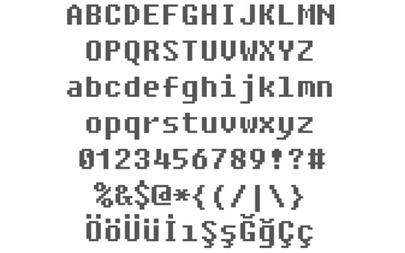
🟨 preview: Fixedsys
Ubuntu font. Idk why but I like it.
I agree! Nice memories of hitting backspace in a Linux Mint terminal and hearing that weird-ass BWOUP sound.
I recommend Ubuntu Mono for Termux users. Look at this black-background beauty – way better than the angly flat default
I like Maple Mono https://github.com/subframe7536/maple-font
An independent open source font, interesting. Looks pretty too, especially for multiple colors
🟨 preview: Maple Mono
I don’t have a favorite system font, am I meant to? I did try to play with fonts at one point but the process of finding fonts and then figuring out how to install them was a bit much.
I know that this will anger some people, but I just use the defaults and I don’t get why there are so many fonts, since they don’t seem that much different to me.
I’m design nerd and definitely appreciate the variety but you don’t gotta be. The defaults are generally pretty good (if not great) with any major OS these days.
I don’t get why there are so many fonts
Because anyone can design one.