

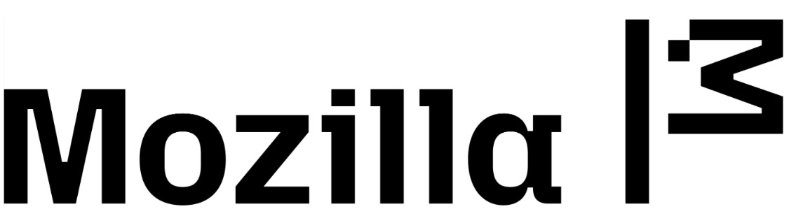
The only REAL Mozilla logo

Ew the new one sucks. Why can’t they spend the money that they have on important stuff instead of changing logos every couple of years? Uk, considering that their funding is going to dry up because of the Google anti trust case?
Because they don’t have money
Am I the only one who only sees a pitch black image?
Pretty sure it’s black on transparent. Not the most visible, especially if your client makes the background black.
I switched to light mode to take a look at it and now I can confirm it looks absolutely terrible.
Can confirm, it looked better as a pitch black blob.
Ugh. Requiring your users enable light mode to look at an image is just cruel and unusual punishment…
I took a screenshot
As a calligrapher, this is not pleasing to look at. Far from it.
As not a calligrapher, I agree.
You, my friend, are a truly unsung hero. ❤️
Also, damn, that’s an ugly logo…
I have to admit, I really don’t like this. The old logo looked pretty neat and the “://” part was a stroke of genius.
I 100% agree. I don’t mind design refreshes. I think I’m in the minority of loving the current Firefox logo.
But this just sucks. They really took their unique, clever wordmark logo (but still very modern and minimal!) and replaced it with a bland, trendy 2022 typeface.
I know this is super petty, but this might convince me to find another password manager and method for syncing tabs. Might try librewolf, too. Rebranding invites users to re-evaluate their view on a brand, and mine isn’t changing for the better.
The moz://a logo is really genius. I wonder if their current leadership is so incompetent that they don’t even understand the :// part of the logo…
I think that question can be answered by the recent horrible series of decisions by them. Mozilla really has been captured by the roots of enshittification at this point.
Yeah, I remember the first time I saw the :// thing I felt myself having a little design-gasm.
This doesn’t touch the same spot for me…They even implemented it in Firefox: moz://a redirects to https://www.mozilla.org/en-US/about/manifesto/
As will any moz://
I mean, if the intention is to reflect the utterly bad decisions Mozilla has made, this new logo would be spot on
Nope. I mean I don’t really care. But it definitely doesn’t appeal to me.
Why do companies constantly feel an urge to update their logos? I see this as marketing teams needing to show they are doing something so they come up with a “project” and then convince the management it’s necessary…
Nobody needs marketing people.
Because the CEO is probably having an existential dread crisis and needs to do something about it. So he fucks up the logo because he can, and fuck you. Now watch Mozilla ads from their newly acquired Ad company.
Great sign that organizational resources are being arranged into a pointless circlejerk safely removed from browser & Thunderbird development, or finding opportunities to monetize that aren’t products nobody asked for outside the nonprofit corporate bureacracy
I do like the new logo, but it is a bit sad to see the :// gone.
Coincidentaly :/ is the symbol for “a bit sad”
Does the flag look like a chicken to anyone else?
Thanks, now I can’t unsee it.
TBH, it’s better as a chicken
It’s probably supposed to be a Godzilla-like creature.
 He’s back from the dead!
My thoughts exactly. It’s an underwhelming throwback in exchange for the pretty clever moz://a pun.
Why did they copy i3?
The font doesn’t look too good
Not even Fira :/
and not Zilla Slab (which even had an opentype feature to replace “Mozilla” with “Moz://a”)
The new logo sort of looks like a white flag. It symbolizes the fact that Mozilla has just completely given up by now.
The flag looks a bit like a disgruntled goose.
lmao
Also hier soll das neue eingebettet sein

Und das ist das alte

Das neue ist hässlich
Should’ve used Papyrus


